The sidebar layout is a double sided navigation layout. It has a sidebar with a list of menu links and a subsidebar with a list of submenu links.
•Layout features
- Navigation Sidebar Item: The icon sidebar is the first part of the double sided navigation of the sidebar layout. It displays the logo and the main navigation icon links. Those navigation items can be displayed as a link or a button that triggers an action.


- Navigation Subsidebar: The subsidebar works as a submenu element for each navigation item. It's a custom component that you have to create. We provide a set of components and prebuilt variations to help you to build it.
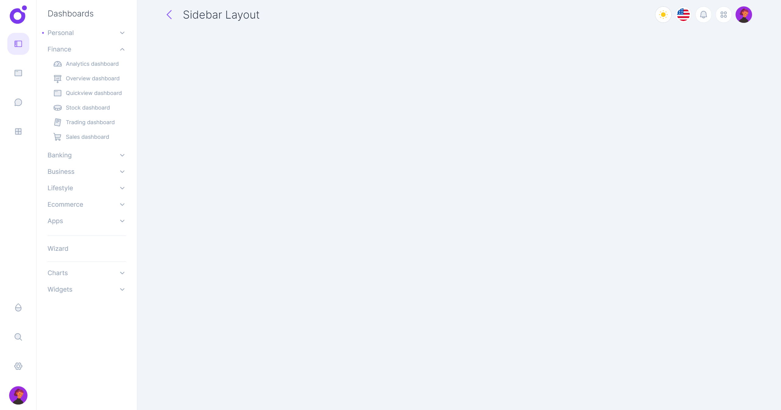
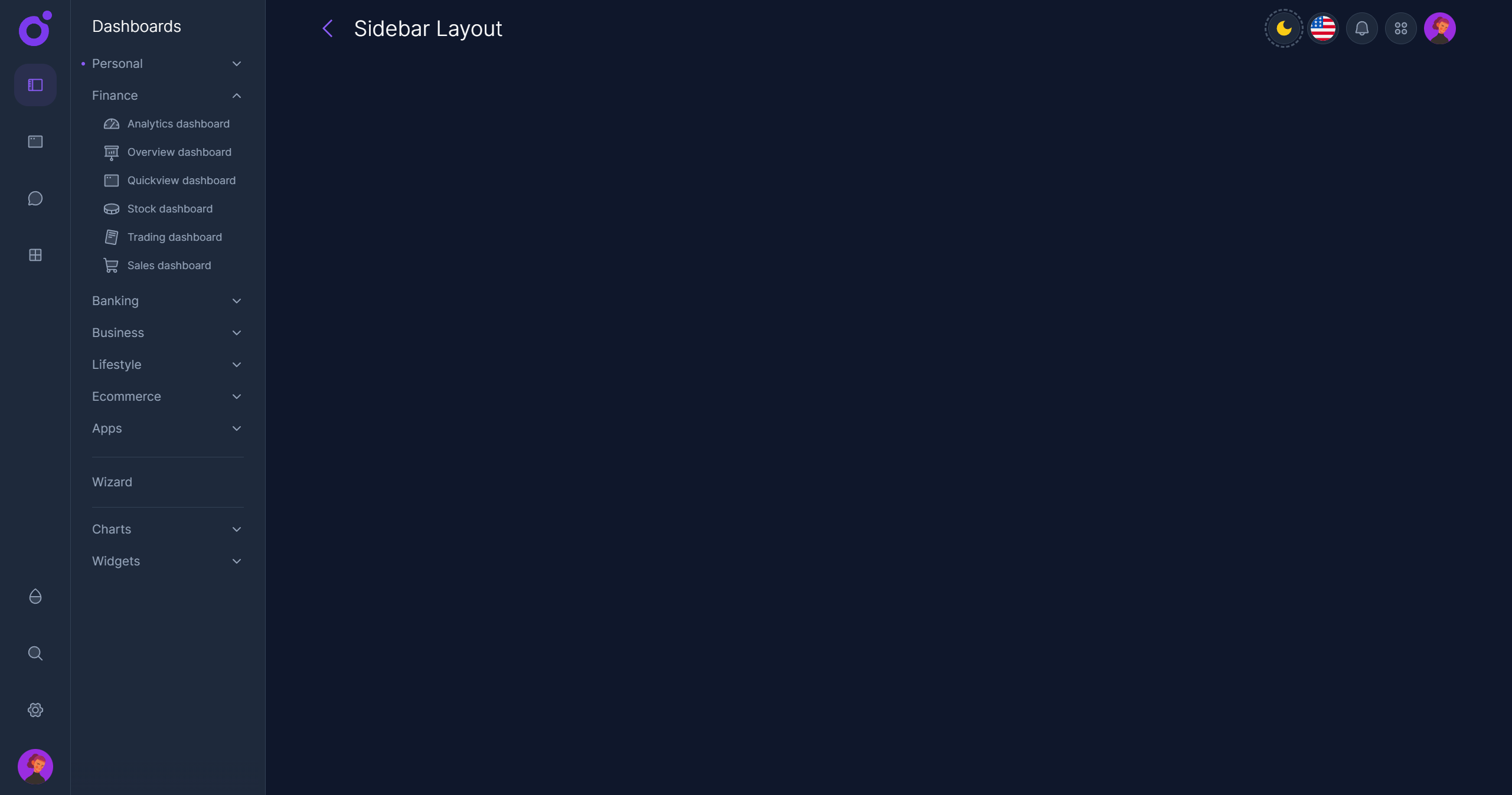
- Toolbar: The toolbar is displayed at the top of the main content area. It can be used to display the current page title and a set of quick actions.


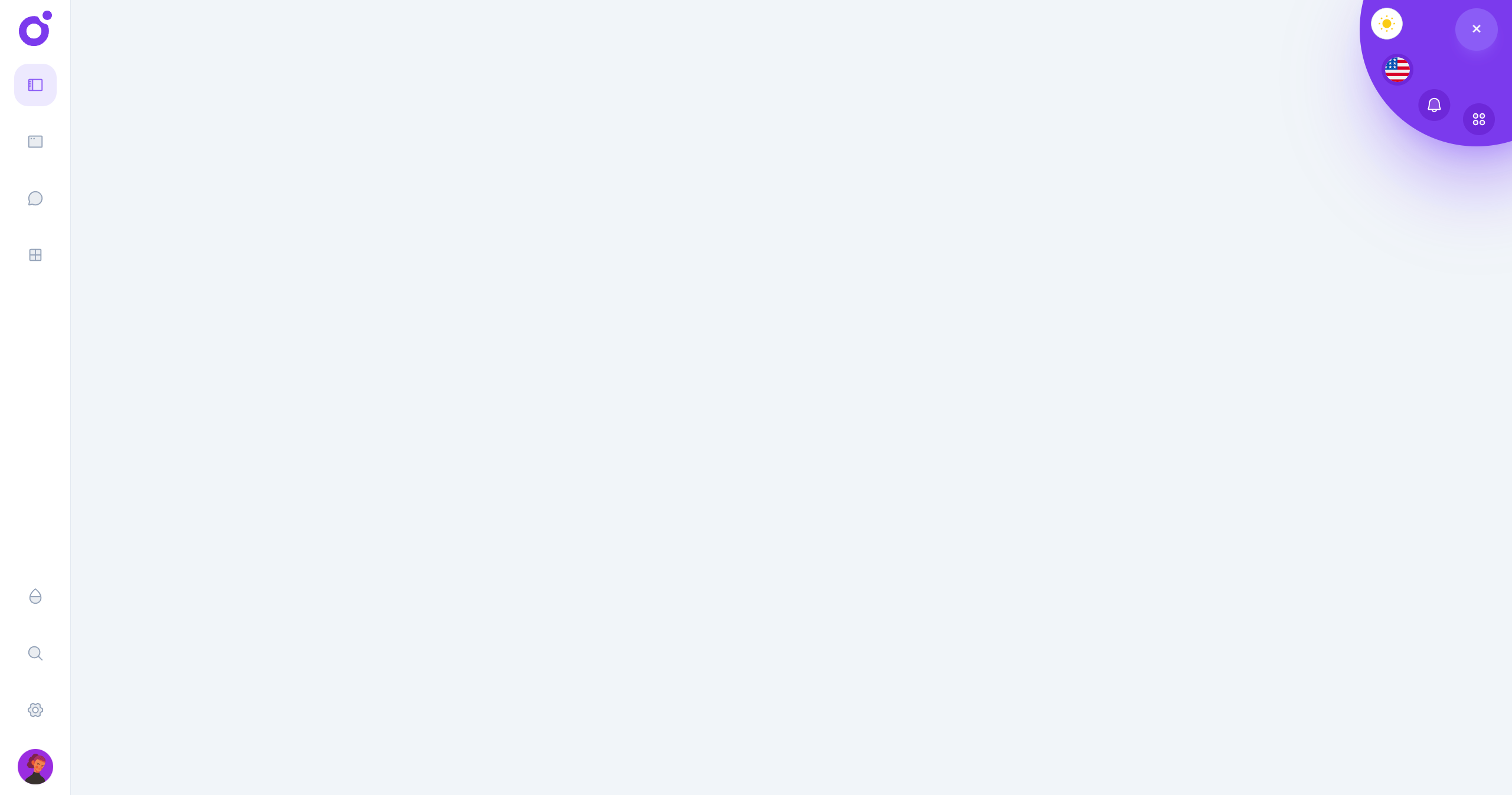
- Circular menu: When scrolling down, the circular menu is displayed at the top right of the screen. It can be used to display a set of quick actions.

If you feel the sidebar has too many items for your app, you can use a smaller option that is the collapse layout.
First you need to enable the sidebar layout layer in the <app>/nuxt.config.ts file.
Then you can configure the sidebar layout in the <app>/app.config.ts file.
•Default configuration
You don't need to specify all the properties, only the ones you want to override.
•Tools
To add tools to the toolbar or the circular menu, you have to create global components, and add them to the tools array.
•Navigation Logo
The default configuration will display the logo in the sidebar as:
You can create a component with the same name in your app to override the default logo. (The component must be registered as global)
Alternatively, you can display an image with:
•Navigation Items