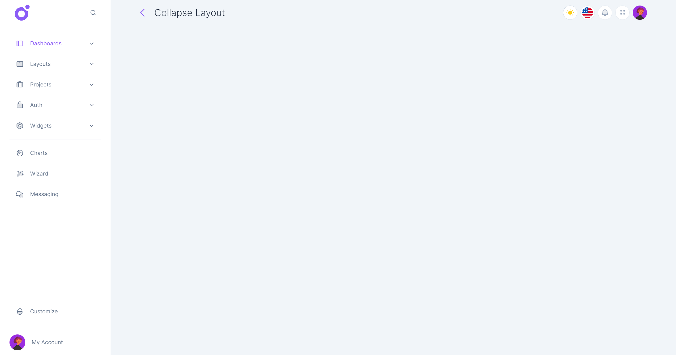
The collapse layout focuses on a single sidebar with a list of menu links, ideal for smaller apps if you don't have enough content or pages to use a more complex layout like the sidebar layout.
•Layout features
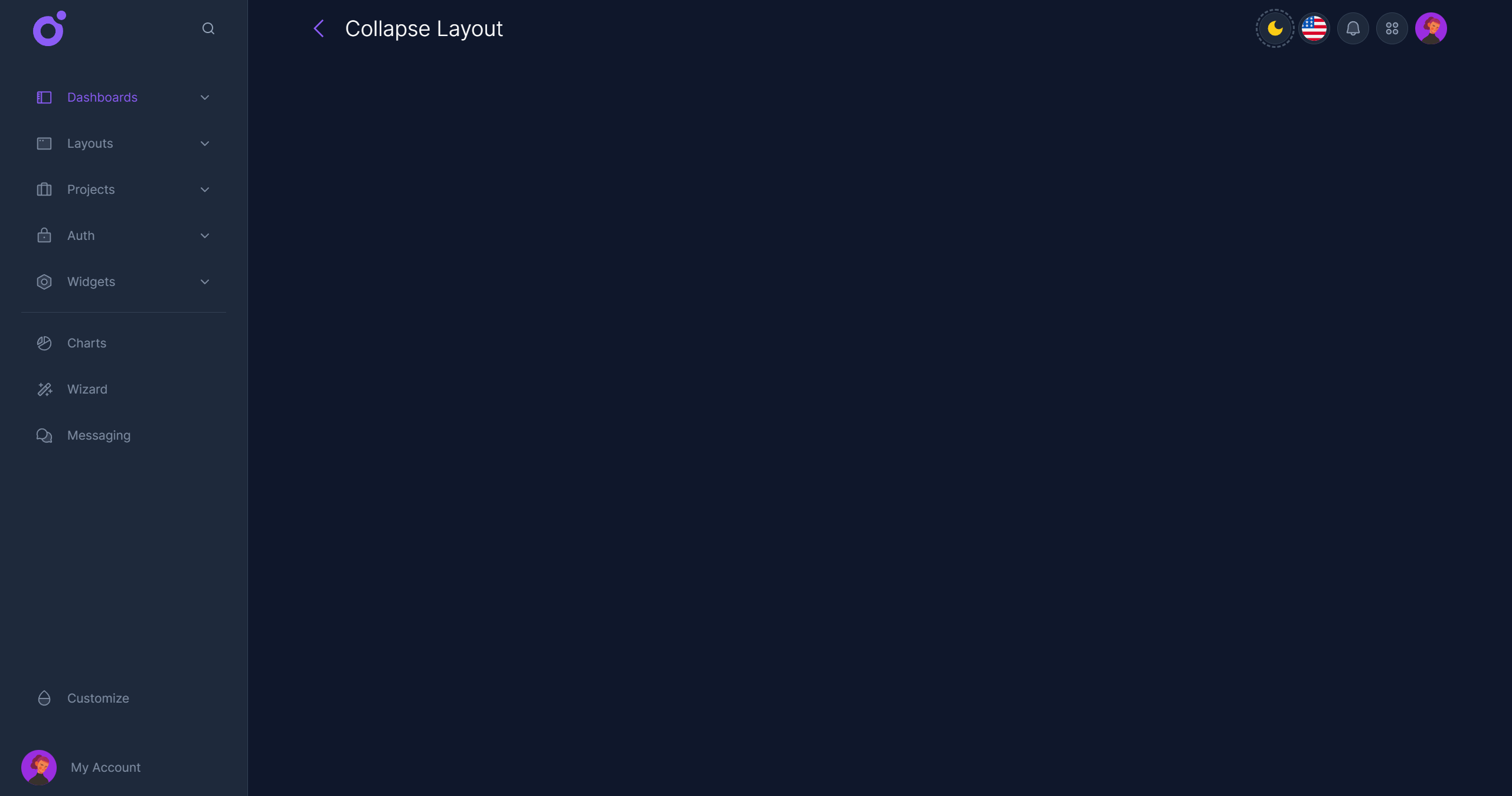
- Navigation (expanded):
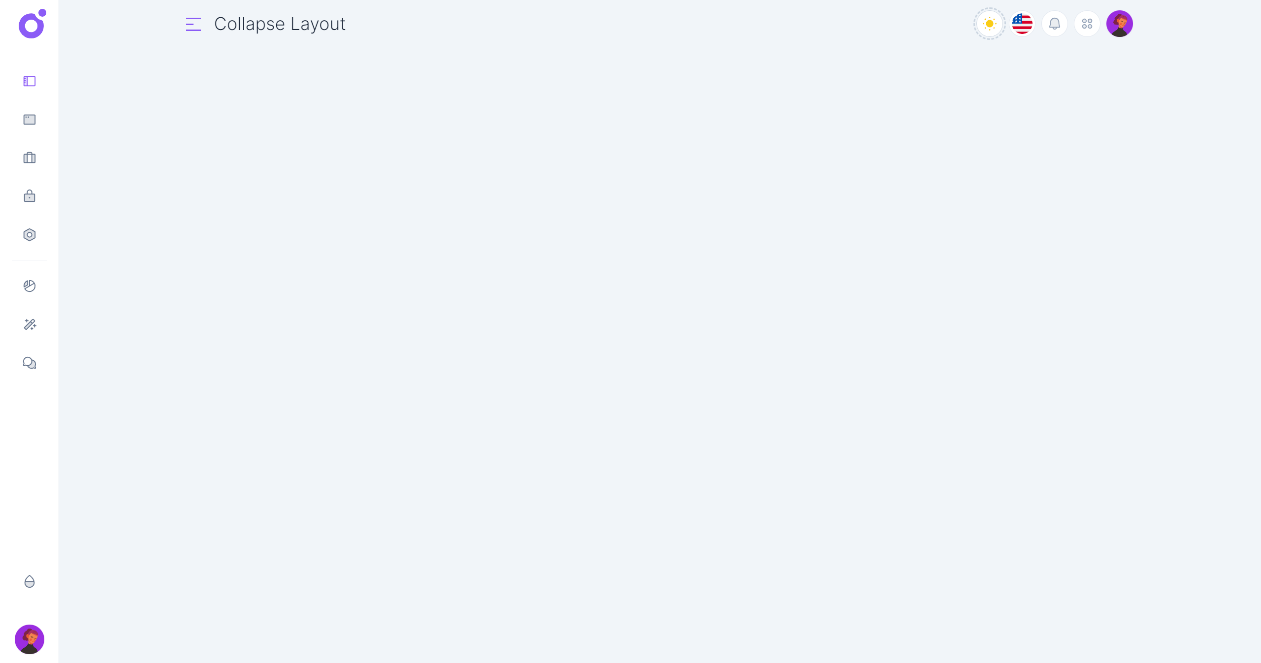
- Navigation (collapsed): The collapse layout can be folded into an icon sidebar. The collapse layout can have single menu links or submenu links. Clicking on a submenu link will revert the sidebar to its uncollapsed state

- Toolbar: The toolbar is displayed at the top of the main content area. It can be used to display the current page title and a set of quick actions.


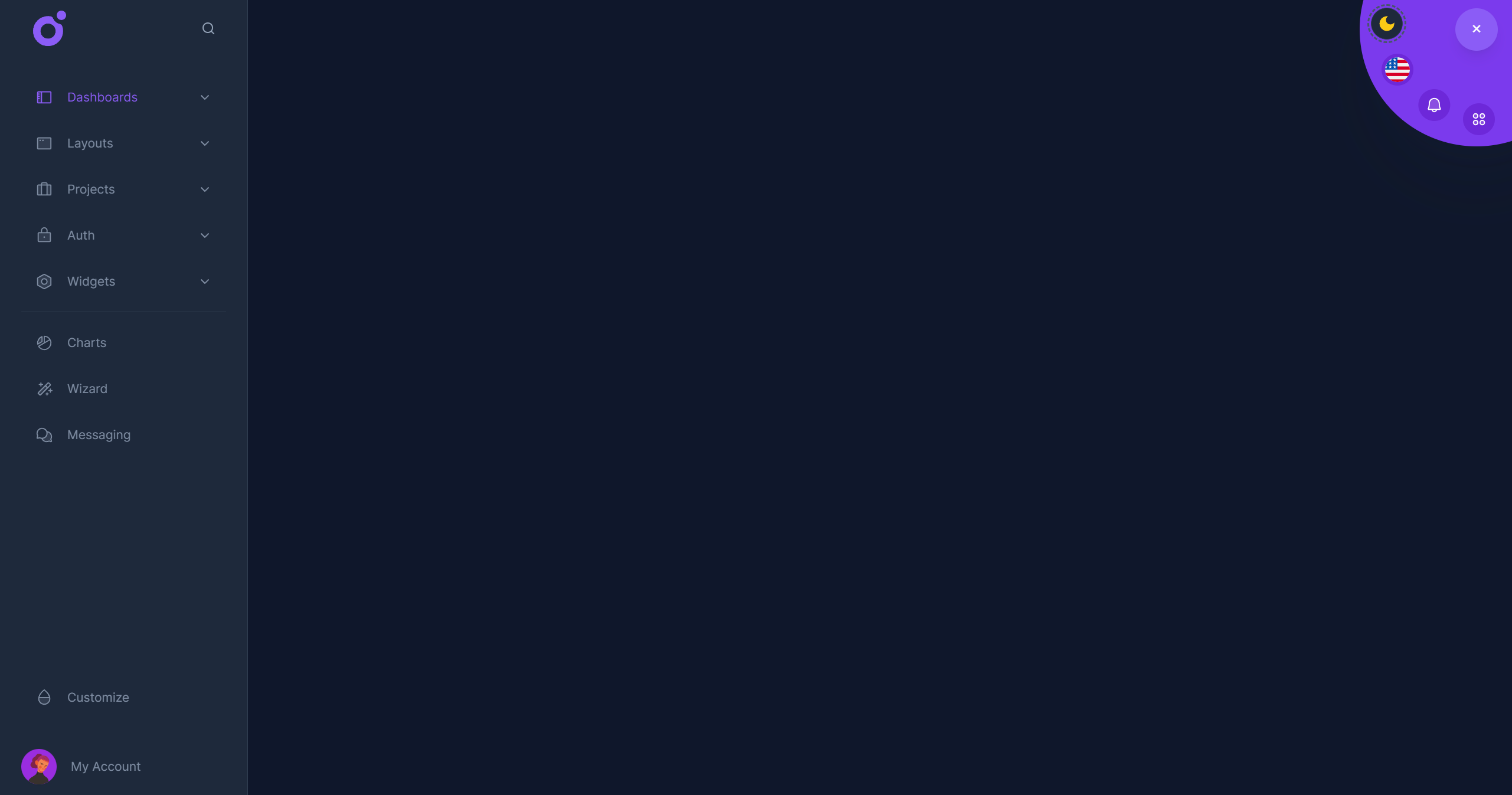
- Circular menu: When scrolling down, the circular menu is displayed at the top right of the screen. It can be used to display a set of quick actions.

First you need to enable the collapse layout layer in the <app>/nuxt.config.ts file.
ts
Then you can configure the collapse layout in the <app>/app.config.ts file.
ts
•Default configuration
ts
You don't need to specify all the properties, only the ones you want to override.
•Tools
To add tools to the toolbar or the circular menu, you have to create global components, and add them to the tools array.
ts
•Navigation Header
You can add a header or/and a footer to the navigation sidebar. You can use a global component or a local component.
ts
•Navigation items
ts