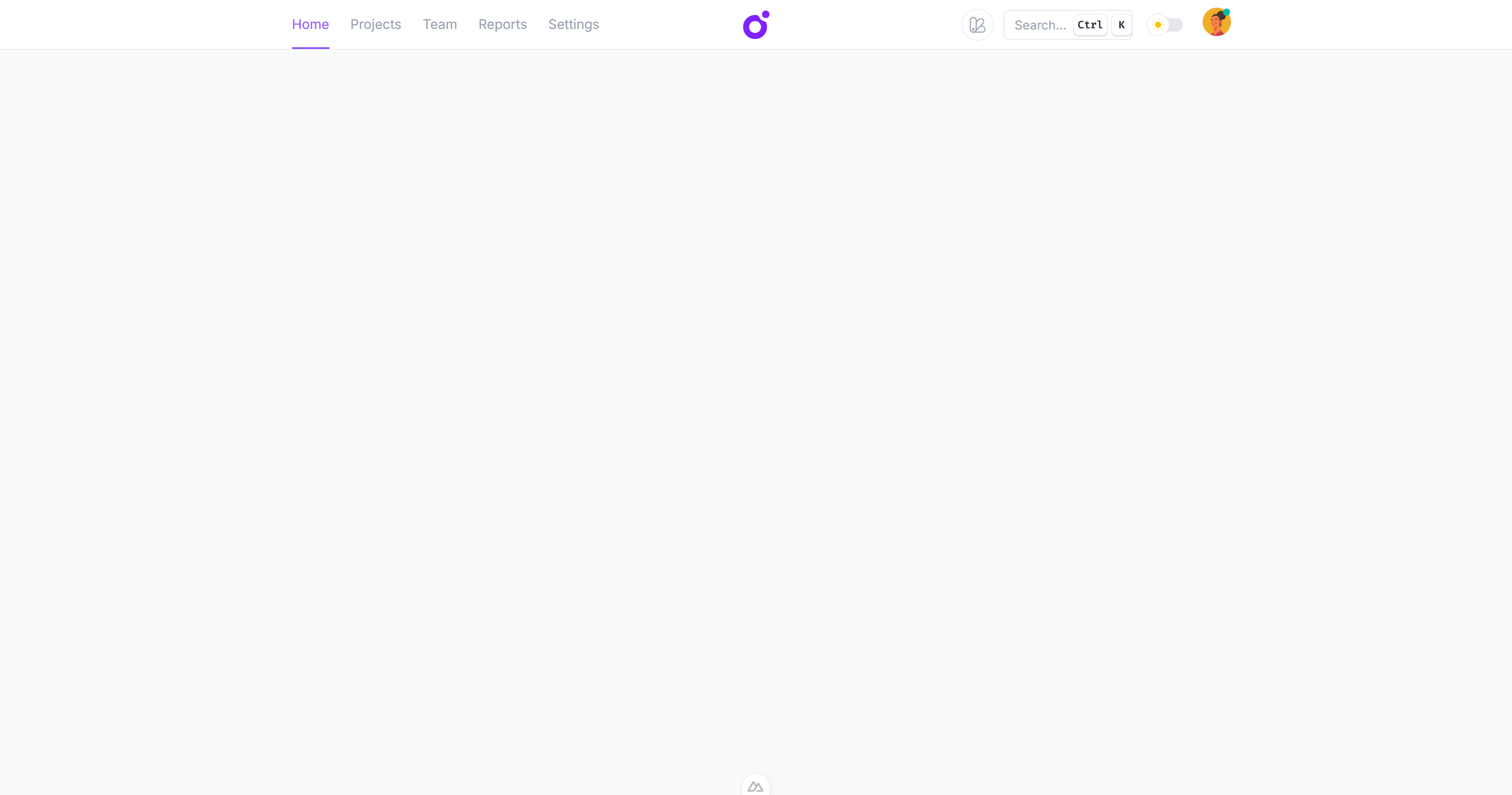
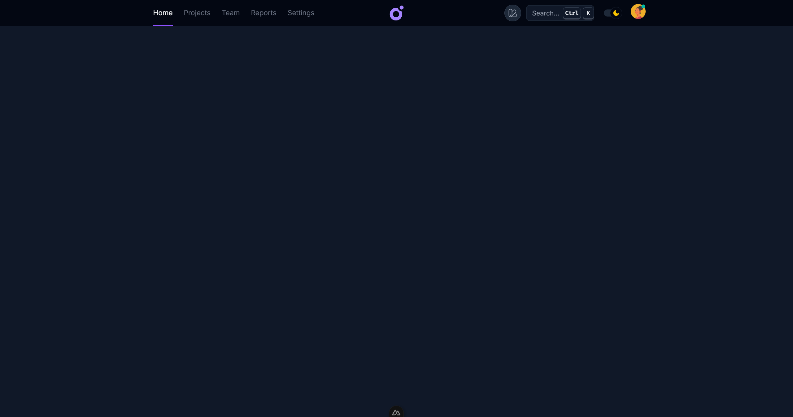
Topnav layout
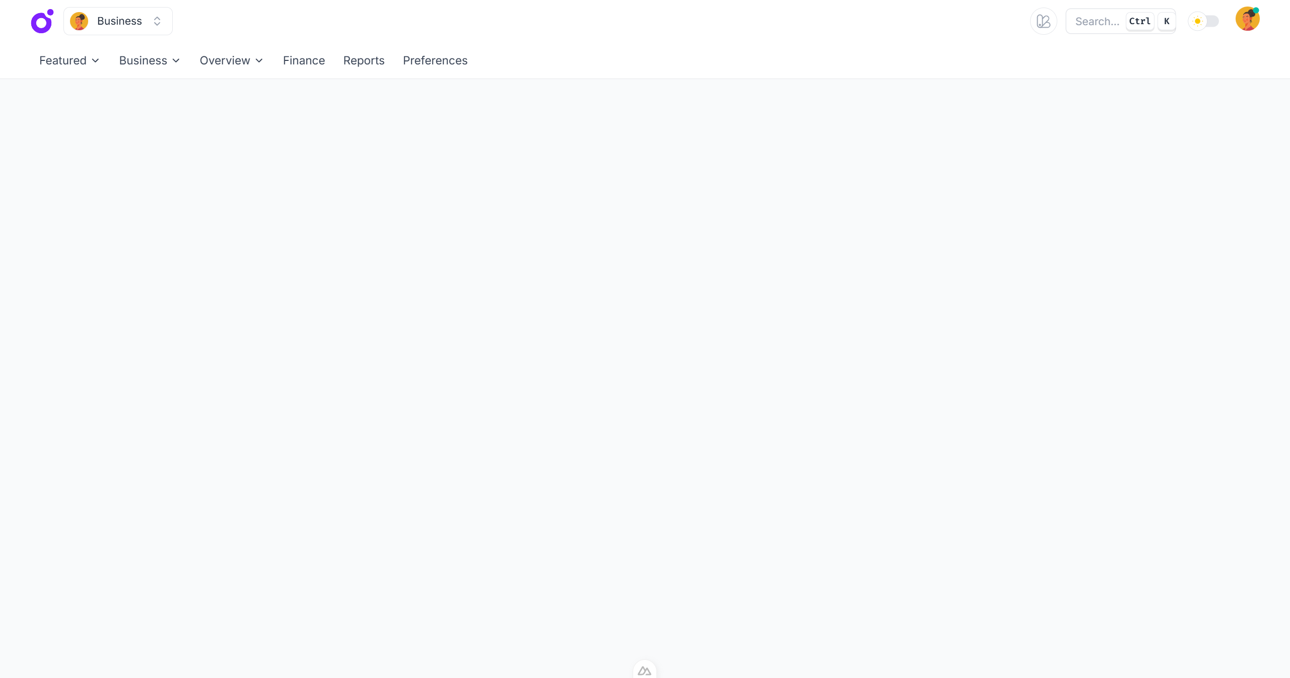
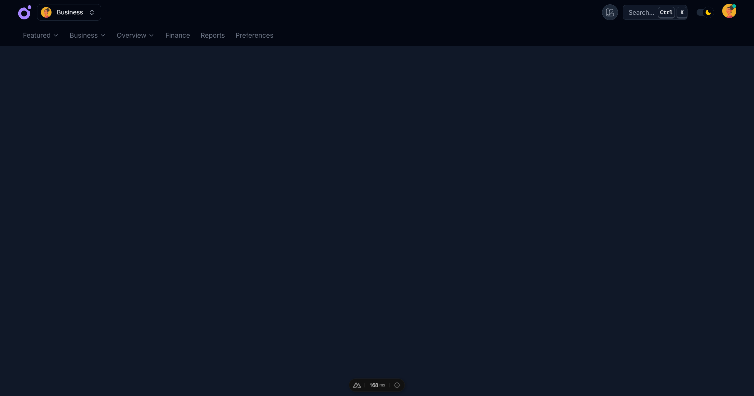
Overview
The topnav layout provides a top navigation bar with a header and content area. It is useful for applications that need to display full width content. You can either use button style navigation links wuth dropdowns or a simple list of tabbed links.
Features
- Full width navigation
- Customizable header
- Includes customizable dropdowns
- Responsive support
Anatomy
vue
<template>
  <TairoTopnavLayout>
    <TairoTopnavNavbar>
      <TairoTopnavHeader>
        <TairoTopnavContent />
      </TairoTopnavHeader>
    </TairoTopnavNavbar>

    <TairoTopnavContent>
      <slot />
    </TairoTopnavContent>
  </TairoTopnavLayout>
</template>
css
@theme {
  --tairo-topnav-content-width: 100%;
}
Components
TairoTopnavLayout
| Prop | Type |
|---|---|
classdefault: - | unknown |
keydefault: - | PropertyKey |
refdefault: - | VNodeRef |
ref-fordefault: - | boolean |
ref-keydefault: - | string |
styledefault: - | unknown |
| Slot | Type |
|---|---|
#default | { isMobileOpen: any; } |
TairoTopnavNavbar
| Prop | Type |
|---|---|
classdefault: - | unknown |
keydefault: - | PropertyKey |
refdefault: - | VNodeRef |
ref-fordefault: - | boolean |
ref-keydefault: - | string |
styledefault: - | unknown |
| Slot | Type |
|---|---|
#default | {} |
TairoTopnavHeader
| Prop | Type |
|---|---|
classdefault: - | unknown |
hidedefault: - | "scroll" | "scroll-down" |
keydefault: - | PropertyKey |
refdefault: - | VNodeRef |
ref-fordefault: - | boolean |
ref-keydefault: - | string |
styledefault: - | unknown |
| Slot | Type |
|---|---|
#default | {} |
TairoTopnavContent
| Prop | Type |
|---|---|
classdefault: - | unknown |
keydefault: - | PropertyKey |
refdefault: - | VNodeRef |
ref-fordefault: - | boolean |
ref-keydefault: - | string |
styledefault: - | unknown |
| Slot | Type |
|---|---|
#default | {} |