Sidebar layout
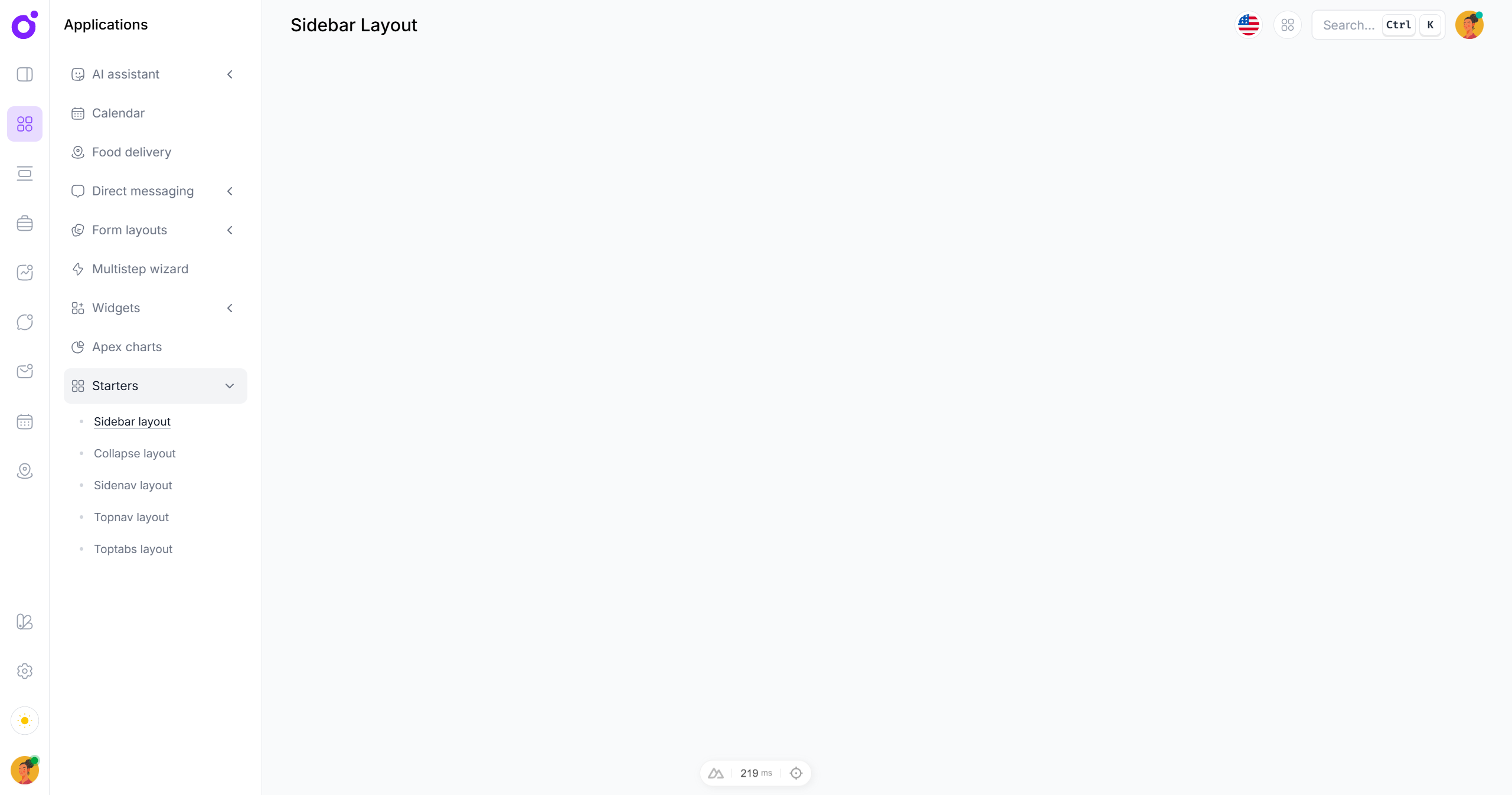
Overview
The sidebar layout is a double sided navigation layout. It has a sidebar with a list of items that can either be links or buttons, and customizable subsidebars that can be toggled based on the active item.
Features
- Solid app navigation
- Customizable subsidebars
- Single or nested links
- Responsive support
Anatomy
<template>
  <TairoSidebarLayout>
    <TairoSidebarNav>
      <TairoSidebar>
        <TairoSidebarLinks>
          <TairoSidebarTrigger />
        </TairoSidebarLinks>
      </TairoSidebar>

      <TairoSidebarSubsidebar>
        <TairoSidebarSubsidebarHeader />

        <TairoSidebarSubsidebarContent>
          <TairoSidebarSubsidebarLink />
          <TairoSidebarSubsidebarCollapsible>
            <template #trigger>
              <TairoSidebarSubsidebarCollapsibleTrigger />
            </template>

            <TairoSidebarSubsidebarCollapsibleLink />
          </TairoSidebarSubsidebarCollapsible>
        </TairoSidebarSubsidebarContent>
      </TairoSidebarSubsidebar>
    </TairoSidebarNav>

    <TairoSidebarContent>
      <slot />
    </TairoSidebarContent>
  </TairoSidebarLayout>
</template>
@theme {
  --tairo-sidebar-icon-width: 3.5rem;
  --tairo-sidebar-subsidebar-width: 15rem;
}
Components
TairoSidebar
| Prop | Type |
|---|---|
classdefault: - | unknown |
keydefault: - | PropertyKey |
refdefault: - | VNodeRef |
ref-fordefault: - | boolean |
ref-keydefault: - | string |
styledefault: - | unknown |
| Slot | Type |
|---|---|
#default | {} |
TairoSidebarBackdrop
| Prop | Type |
|---|---|
classdefault: - | unknown |
keydefault: - | PropertyKey |
refdefault: - | VNodeRef |
ref-fordefault: - | boolean |
ref-keydefault: - | string |
styledefault: - | unknown |
TairoSidebarLayout
| Model | Type |
|---|---|
v-model | string |
| Prop | Type |
|---|---|
classdefault: - | unknown |
default-valuedefault: - | string |
keydefault: - | PropertyKey |
refdefault: - | VNodeRef |
ref-fordefault: - | boolean |
ref-keydefault: - | string |
styledefault: - | unknown |
| Slot | Type |
|---|---|
#default | { isMobileOpen: any; toggleMobileNav: any; modelValue: any; } |
TairoSidebarContent
| Prop | Type |
|---|---|
classdefault: - | unknown |
keydefault: - | PropertyKey |
refdefault: - | VNodeRef |
ref-fordefault: - | boolean |
ref-keydefault: - | string |
styledefault: - | unknown |
| Slot | Type |
|---|---|
#default | {} |
TairoSidebarNav
| Prop | Type |
|---|---|
classdefault: - | unknown |
keydefault: - | PropertyKey |
refdefault: - | VNodeRef |
ref-fordefault: - | boolean |
ref-keydefault: - | string |
styledefault: - | unknown |
| Slot | Type |
|---|---|
#default | {} |
TairoSidebarLinks
| Prop | Type |
|---|---|
classdefault: - | unknown |
keydefault: - | PropertyKey |
refdefault: - | VNodeRef |
ref-fordefault: - | boolean |
ref-keydefault: - | string |
styledefault: - | unknown |
| Slot | Type |
|---|---|
#default | {} |
TairoSidebarLink
| Prop | Type |
|---|---|
activedefault: - | boolean |
classdefault: - | unknown |
icondefault: - | string |
keydefault: - | PropertyKey |
refdefault: - | VNodeRef |
ref-fordefault: - | boolean |
ref-keydefault: - | string |
styledefault: - | unknown |
todefault: - | any |
| Slot | Type |
|---|---|
#default | {} |
TairoSidebarTrigger
| Prop | Type |
|---|---|
valuedefault: - | string |
classdefault: - | unknown |
icondefault: - | string |
keydefault: - | PropertyKey |
refdefault: - | VNodeRef |
ref-fordefault: - | boolean |
ref-keydefault: - | string |
styledefault: - | unknown |
| Slot | Type |
|---|---|
#default | {} |
TairoSidebarSubsidebar
| Prop | Type |
|---|---|
valuedefault: - | string |
classdefault: - | unknown |
keydefault: - | PropertyKey |
refdefault: - | VNodeRef |
ref-fordefault: - | boolean |
ref-keydefault: - | string |
styledefault: - | unknown |
| Slot | Type |
|---|---|
#default | {} |
TairoSidebarSubsidebarHeader
BaseHeading| Prop | Type |
|---|---|
classdefault: - | unknown |
keydefault: - | PropertyKey |
refdefault: - | VNodeRef |
ref-fordefault: - | boolean |
ref-keydefault: - | string |
styledefault: - | unknown |
| Slot | Type |
|---|---|
#default | {} |
TairoSidebarSubsidebarLink
| Prop | Type |
|---|---|
classdefault: - | unknown |
icondefault: - | string |
keydefault: - | PropertyKey |
labeldefault: - | string |
refdefault: - | VNodeRef |
ref-fordefault: - | boolean |
ref-keydefault: - | string |
styledefault: - | unknown |
todefault: - | any |
| Slot | Type |
|---|---|
#default | {} |
TairoSidebarSubsidebarCollapsible
CollapsibleRoot| Prop | Type |
|---|---|
asdefault: - | AsTag | ComponentThe element or component this component should render as. Can be overwritten by `asChild`. |
as-childdefault: - | booleanChange the default rendered element for the one passed as a child, merging their props and behavior. Read our [Composition](https://www.reka-ui.com/docs/guides/composition) guide for more details. |
childrendefault: - | { to: string; label: string; }[] |
classdefault: - | unknown |
default-opendefault: - | booleanThe open state of the collapsible when it is initially rendered. Use when you do not need to control its open state. |
disableddefault: - | booleanWhen `true`, prevents the user from interacting with the collapsible. |
icondefault: - | string |
keydefault: - | PropertyKey |
labeldefault: - | string |
opendefault: - | booleanThe controlled open state of the collapsible. Can be binded with `v-model`. |
refdefault: - | VNodeRef |
ref-fordefault: - | boolean |
ref-keydefault: - | string |
styledefault: - | unknown |
unmount-on-hidedefault: - | booleanWhen `true`, the element will be unmounted on closed state. |
| Event | Emitted Value Type |
|---|---|
update:open | [value: boolean] |
| Slot | Type |
|---|---|
#trigger | {} |
#default | {} |
TairoSidebarSubsidebarCollapsibleLink
| Prop | Type |
|---|---|
classdefault: - | unknown |
keydefault: - | PropertyKey |
labeldefault: - | string |
refdefault: - | VNodeRef |
ref-fordefault: - | boolean |
ref-keydefault: - | string |
styledefault: - | unknown |
todefault: - | any |
| Slot | Type |
|---|---|
#default | {} |
TairoSidebarSubsidebarCollapsibleTrigger
CollapsibleTrigger| Prop | Type |
|---|---|
classdefault: - | unknown |
icondefault: - | string |
keydefault: - | PropertyKey |
labeldefault: - | string |
refdefault: - | VNodeRef |
ref-fordefault: - | boolean |
ref-keydefault: - | string |
styledefault: - | unknown |
| Slot | Type |
|---|---|
#default | {} |
TairoSidebarSubsidebarContent
| Prop | Type |
|---|---|
classdefault: - | unknown |
keydefault: - | PropertyKey |
refdefault: - | VNodeRef |
ref-fordefault: - | boolean |
ref-keydefault: - | string |
styledefault: - | unknown |
| Slot | Type |
|---|---|
#default | {} |
TairoSidebarSubsidebarHeader
| Prop | Type |
|---|---|
classdefault: - | unknown |
keydefault: - | PropertyKey |
refdefault: - | VNodeRef |
ref-fordefault: - | boolean |
ref-keydefault: - | string |
styledefault: - | unknown |
| Slot | Type |
|---|---|
#default | {} |